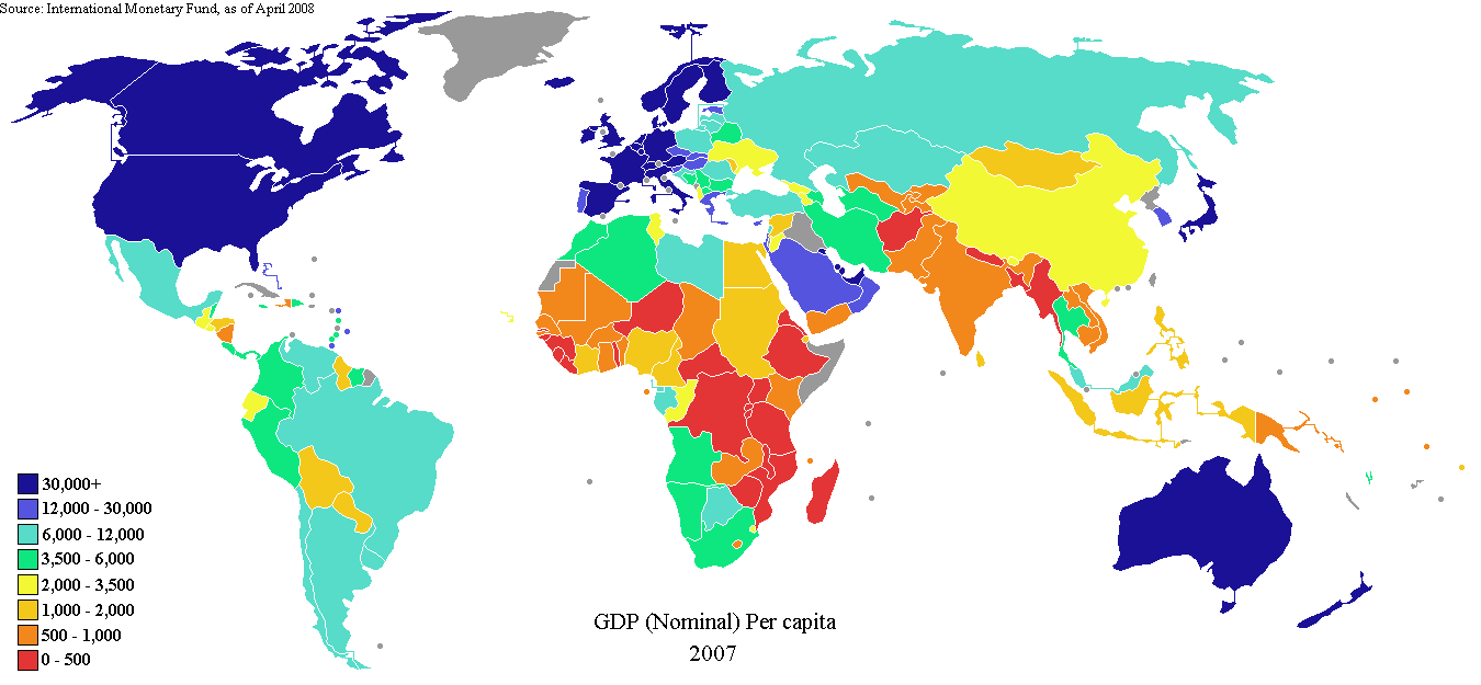
An example of standardized choropleth map. The map is standard bt using a a standard type of data such as population. the data or interval is color coded to show population in canada in 2006.
An example of bivariate map. The map shows two types of data. This map shows life expectancy and gross national products in 1989 as the intervals. The key shows the legend and corresponding colors to show the data.http://www.geocities.com/stevejford/Africa_Choropleth.jpg
An example of a contnuosly variable circle map. The circles are visual representation of data. The larger the circle the greater the amount of data an vice versa which makes it variable.
A DOQQ photo is a aerial photo that has been corrected by using a mathematical formula. this correction is called orthorectified. The photo is then considered equivalent ot a map. http://www.usgsquads.com/prod_doqq.htm
An example of a DLG map. A DLG is short for digital line graph. Cordinates are formed or used in vector form to show cartographic information. This map is a view of Athen GA. http://ga.water.usgs.gov/olympics/athens.dlg.gif
An example of a DRG map. It's a digital rastor graphic scanned from USGS topographic maps. The map is georefereced to the mercator projection http://lter.kbs.msu.edu/maps/GIS/DRG_d.jpg
An example of an isopleth map showing hydrogen ion concentration as PH. Note the colors used to show the concentrations that equal across the USA. Shades of color are used to show the amount of concentration. It defers from a chloropleth becase the boundries are aranged according to the data used. http://www.epa.gov/castnet/images/ph_map.gif
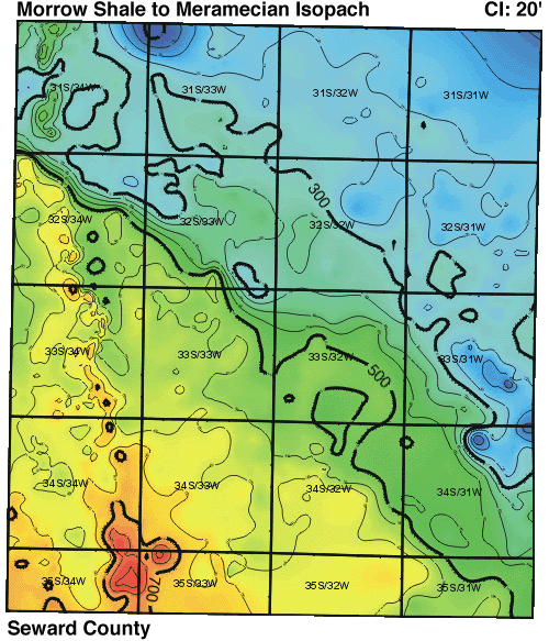
An example of a isopach. An isopach shows a relief of oceans,seas, that are not visible. These maps are used by geologist,oceanographers to determine rock formations and there depth. http://www.kgs.ku.edu/DPA/County/rs/gif_sw/morrow_meramec.gif
An example of isohyets. Isohyets is a contour map showing rainfall. This example is Africa. The legend on the bottom left shows a color coded key of the amount of rainfall. The white areas show minimal rain the dark green shows the most rainfall. The map is not clear if it is inches, meters etc. www.artsci.wustl.edu/.../courses/306/precip.GIF
An example of isotachs. The contour type lines show wind direction. Wind direction is shown by barbs on the contour lines. Numbers near the contour show the altitude and wind speed. Similiar to isobars. http://www.ametsoc.org/AMSedu/dstreme/images/ua_300w.gif
An example of a isobar of western europe. The isobars are the contour lines that show atmospheric presure. the closer the isobars are the conditions for strong winds are greater. http://www.wsurf.net/pics/vrijeme/data/isobar-map.gif
An example of LIDAR map. A LIDAR uses lasers measurements taken from an airplane. The LIDAr detrmines or measures depth and relief. This is a before and after of Hurricaine Rita in 2001. The left side shows a before aerial photo and the left a LIDAR image. http://coastal.er.usgs.gov/hurricanes/rita/lidar/hollybeach.html
An example of infrared aerial photo. The city of Massena NY. The town an village boundries are shown in red according to the website. It is used to evaluate land use , zoning and environmental resources in the town.http://www.cedareden.com/massena/gis.html
An example of a statistical map. This map is shows northern Africa and the Middle East. The map shows how many people are online in theses countries. The darker the shade the more of the population is online.http://www.arabdev.org/map
This is an example of a flow map from the DEA wbsite showing the flow of contraband in Latin America to the Untited States. The arrows are shown as vectors and is broken down by percentage. at www.usdoj.gov
This is an example of a proportional circle map of the Michigan area. It is showing the census from 1970. Dots are showing the urban and rural populations of the area. the size of each dot is determined by the amount of people living in that particular area.http://mapmaker.rutgers.edu/355/links.html
This is an example of a dot distribution map. http://www.wisconline.com/It shows census data of Milwaukee county from 1990. According to the website each dot on the map represents 50 people. The map shows a density of people living near the urban areas. As you view the map of the norteast and southern parts of the county the population is spread out revealing the suburban area. This map was used for protection of natural resources and the stress of population on the environment
This is an example of a propaganda map. Supposedly every map printed in argentina shows the Falkland Islands (which is British territory ) Children are taught at a young age that these islands belong to Argentina
This is a an example of a hypsometric map of a region in map. Hypsometric maps show relief and elevation through the use of colors and shading. sometimes the shading used resembles the shadow that the elevation would make. couresy of http://www.reliefshading.com/colors/hypsometric.html
This is an example of a PLSS of a root watershed.This watershed is located in Dodge, Fillmore, Houston, Mower, Olmsted and Winona Counties in Southeast Minnesota, and Winneshiek County in Northern Iowa. Note the grid system of the PLSS. The watershe dcontains cropland, forestland and pastures.
This an image of a cadasatral map. A cadastral map shows land ownership in the form of parcels, lots, etc. It can also show value and location. The maps are used in legal issues and usually are located and used in government. This map is couresy of http://www.dgs-gis.cz/mapy.php?store_lang=en