Saturday, December 6, 2008

star plot


An example of a star plot chart. The data is shown in three dimensions. often computer generated to show the variables and data. The variables are shown in spokes. A line is drawn between each variable to show the data of each variable. The chart shown is for car, showing year, horsepower, and other information. http://www.teamset.com/tools/qfd/images/correlation.gif

correlation matrix


An example of a correlation matrix. Showing data, and its correlation to other data on the chart. The data on the vertical and horizontal are the same. Each data is charted to itself and the other sets of data to find a similar correlation. http://www.teamset.com/tools/qfd/images/correlation.gif

similarity matrix


An example of a similarity matrix. It shows similarities between variables. It shows the corelation between data. The similiar the data the greater the correlation and the higher the values the greater correlation beween the data sets. http://www.biomedcentral.com/content/figures/1471-2164-8-353-5-l.jpg

stem and leaf plot


An example of a stem and leaf plot. It is similiar to a histogram. The data is seperated to significant digits. the stem is the vertical dat on the right. The leaves are the data on left. This type of graph is less commonly used with the advent of computers and using histograms. http://www.uow.edu.au/student/attributes/statlit/modules/images/2_50.gif

box plot


An example of a boxplot chart. Used to show data. The whiskers or lines drawn from each box is the distiguishing feature of this type of graph. The whiskers are a range in the data. http://www.centgraf.net/metroviz/images/graph_eg_statrboxplot.gif

histogram


An example of a histogram. It is similiar to bilateral graph. The graph shows data with usually one variable. The variables are shown as bars. The data is shown in a distribution with the heights of the bar showing the data. http://www.physics.csbsju.edu/stats/display.distribution.html

parallel coordinate graph


An example of a parallel coordinate graph. The graph is similiar to a scatterplot. The graph shows a variety of data and it shows the correlation of the data with variables. The visual shows statistics for a base ball player. Homeruns,walks, at bats etc..http://www.matthewtavares.com/baseball_report/

triangular plot


An example of a triangular plot. The chart shows three variables. This particlaur chart shows three types of rock formations and the percentage of each variable within the chart. http://ammin.geoscienceworld.org/content/vol87/issue5-6/images/small/0690F02.gif

windrose

An example of a windrose. This chart displays a compass style map showing direction. The color coded legend shows speed of wind for this particular day and it shows the percentage of the day that the amount and direction of wind blowing. http://www.teylingenweer.nl/graph/windrose.gif

climograph


An example of a climograph. This graph shows the precipitation for the town of Anniston Al. The graph shows two sets of data, the actual precipitation and the temperature of the town for the same year. http://www.jsu.edu/depart/geography/mhill/port/mv/cprojlmv.html

population profile

An example of a population profile. Using the popuation as data to compare as statistic. this one is divided between male and female and it shows a prjection of the population of canada by 2031.

sctterplot


An example of a scatterplot graph. The graph compares to set of data or variables on a X and Y axis. A visual way to view a relationship of the variables. Used to compare or see a corelation of the data. http://seekingalpha.com/wp-content/seekingalpha/images/PEScatterPlot.jpg

index value plot


An example of an index value plot. This plot is mainly used to show the values of investments during a period of time. Other examples are the index of dow jones industrial, nasdaq, and
s&p 500. The plot has other applications besides economics, also used for other data in sciences etc. http://www.johncon.com/john/correspondence/020326213456.9658-c.jpg

Sunday, November 30, 2008

lorenz curve


An example of a lprenz curve. It shows income distribution among the percentage of poulation in a household. A mathematical formula is used to figure the prbability in the graph. http://content.answers.com/main/content/wp/en/b/bd/Lorenz-curve1.png

bilateral graph


An example of bilateral graph. It compares two or more sets of data in an easy to see visual form. http://www.mofa.go.jp/policy/oda/category/environment/pamph/2001/image/1_3.gif

nominal area choropleth map


An example of a nominal area map. This map shows nominal data. This map shows the gross domestic product of countries from around the world. http://upload.wikimedia.org/wikipedia/commons/7/70/GDP_nominal_per_capita_world_map_IMF_2007.PNG

unstandardized choropelth map


An example of unstandardized choropleth map. The map in not aerally averaged. It shows vacancy by zip code. http://www.sfu.ca/unigis/images/price10.jpg

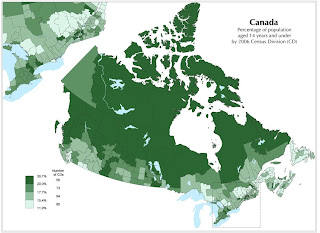
standardized choropleth map

An example of standardized choropleth map. The map is standard bt using a a standard type of data such as population. the data or interval is color coded to show population in canada in 2006.

univariate choropleth map


An example of univariate choropleth map. It shows one form of data. this map is the simplest form to show data, it also is broken down in color coded shades. http://people.cas.sc.edu/hardistf/images/univariate_map.jpg

bivariate choropleth map


An example of bivariate map. The map shows two types of data. This map shows life expectancy and gross national products in 1989 as the intervals. The key shows the legend and corresponding colors to show the data.http://www.geocities.com/stevejford/Africa_Choropleth.jpg

unclassed choropleth map


An example of unclassed choropleth map. No classes defined in itervals. also shows differnent shades or uses color for different types of data.

classed choropleth map


An example of a classed choropleth map. The data is color coded. The degree of shading for the data makes this map unique. The lkey in the corner shows the aamount of methane emissions from cattle in 1992. http://personal.uncc.edu/lagaro/2101/2101_ProjectsS2001/beefmethaneJMK.gif

range graded proportional circle map

An example of a range graded proportional circle map. The map uses several types of data uded as circles. this map uses urban and rural population.

continuosly variable circle map


An example of a contnuosly variable circle map. The circles are visual representation of data. The larger the circle the greater the amount of data an vice versa which makes it variable.

Wednesday, November 26, 2008

DOQQ


A DOQQ photo is a aerial photo that has been corrected by using a mathematical formula. this correction is called orthorectified. The photo is then considered equivalent ot a map. http://www.usgsquads.com/prod_doqq.htm

DEM


A DEM is short for digital elevaton model. Using remote sensing techniques such as satellites and photogametry, a digital relief is created. http://www.bigchicocreek.org/nodes/aboutwatershed/ecr/maps/bigchico_3d_dem_s.jpg

DLG


An example of a DLG map. A DLG is short for digital line graph. Cordinates are formed or used in vector form to show cartographic information. This map is a view of Athen GA. http://ga.water.usgs.gov/olympics/athens.dlg.gif

DRG


An example of a DRG map. It's a digital rastor graphic scanned from USGS topographic maps. The map is georefereced to the mercator projection http://lter.kbs.msu.edu/maps/GIS/DRG_d.jpg

Sunday, November 23, 2008

isopleth

An example of an isopleth map showing hydrogen ion concentration as PH. Note the colors used to show the concentrations that equal across the USA. Shades of color are used to show the amount of concentration. It defers from a chloropleth becase the boundries are aranged according to the data used.
http://www.epa.gov/castnet/images/ph_map.gif

isopach

An example of a isopach. An isopach shows a relief of oceans,seas, that are not visible. These maps are used by geologist,oceanographers to determine rock formations and there depth. http://www.kgs.ku.edu/DPA/County/rs/gif_sw/morrow_meramec.gif

isohyets


An example of isohyets. Isohyets is a contour map showing rainfall. This example is Africa. The legend on the bottom left shows a color coded key of the amount of rainfall. The white areas show minimal rain the dark green shows the most rainfall. The map is not clear if it is inches, meters etc. www.artsci.wustl.edu/.../courses/306/precip.GIF

isotachs


An example of isotachs. The contour type lines show wind direction. Wind direction is shown by barbs on the contour lines. Numbers near the contour show the altitude and wind speed. Similiar to isobars. http://www.ametsoc.org/AMSedu/dstreme/images/ua_300w.gif

isobar


An example of a isobar of western europe. The isobars are the contour lines that show atmospheric presure. the closer the isobars are the conditions for strong winds are greater. http://www.wsurf.net/pics/vrijeme/data/isobar-map.gif

Thursday, November 20, 2008

LIDAR


An example of LIDAR map. A LIDAR uses lasers measurements taken from an airplane. The LIDAr detrmines or measures depth and relief. This is a before and after of Hurricaine Rita in 2001. The left side shows a before aerial photo and the left a LIDAR image. http://coastal.er.usgs.gov/hurricanes/rita/lidar/hollybeach.html

doppler radar


An example of a doppler radar map of the Northeast US. Note the colors show the intensity of the storm. The red area of the map showing a strong cell.

black and white aerial photo


An example of black and white aerial photo. Image is from Northstar Imaging Aerial Photography. A fine art and photography studio in Harrisburg, PA. http://northstargallery.com/aerialphotography/gallerybw.htm

infrared aerial photo


An example of infrared aerial photo. The city of Massena NY. The town an village boundries are shown in red according to the website. It is used to evaluate land use , zoning and environmental resources in the town.http://www.cedareden.com/massena/gis.html

Sunday, November 16, 2008

cartographic animation

An example of cartographic animation found on youtube.com. Shows The Battle of Guilford Courthouse.

statistical map


An example of a statistical map. This map is shows northern Africa and the Middle East. The map shows how many people are online in theses countries. The darker the shade the more of the population is online.http://www.arabdev.org/map

cartogram

This is an example of a cartogram. The geography is distorted to show information about the sorld population. The countries with the most or more populous is distorted to reflect the population size.http://strangemaps.wordpress.com/2007/03/31/96-a-cartogram-of-the-worlds-population

Wednesday, November 5, 2008

flow map


This is an example of a flow map from the DEA wbsite showing the flow of contraband in Latin America to the Untited States. The arrows are shown as vectors and is broken down by percentage. at www.usdoj.gov

isoline map


This is an example of an isoline map. It displays the high temperature of North carolina for January 31, 1981. The temperature interval is Color coded on the bottom right. http://personal.uncc.edu/lagaro/2101/2101_ProjectsS2002/AshleyVoncannon.html

proportional circle map


This is an example of a proportional circle map of the Michigan area. It is showing the census from 1970. Dots are showing the urban and rural populations of the area. the size of each dot is determined by the amount of people living in that particular area.http://mapmaker.rutgers.edu/355/links.html

choropleth map


An example of a chlopleth map showing US farm acreage. Note the interval uses on bottom left corner. Each shade of red showing the amount of acreage.

dot distribution map


This is an example of a dot distribution map. http://www.wisconline.com/It shows census data of Milwaukee county from 1990. According to the website each dot on the map represents 50 people. The map shows a density of people living near the urban areas. As you view the map of the norteast and southern parts of the county the population is spread out revealing the suburban area. This map was used for protection of natural resources and the stress of population on the environment

Propaganda map


This is an example of a propaganda map. Supposedly every map printed in argentina shows the Falkland Islands (which is British territory ) Children are taught at a young age that these islands belong to Argentina

Tuesday, November 4, 2008

hypsometric map


This is a an example of a hypsometric map of a region in map. Hypsometric maps show relief and elevation through the use of colors and shading. sometimes the shading used resembles the shadow that the elevation would make. couresy of http://www.reliefshading.com/colors/hypsometric.html

PLSS map


This is an example of a PLSS of a root watershed.This watershed is located in Dodge, Fillmore, Houston, Mower, Olmsted and Winona Counties in Southeast Minnesota, and Winneshiek County in Northern Iowa. Note the grid system of the PLSS. The watershe dcontains cropland, forestland and pastures.

Cadastral map


This an image of a cadasatral map. A cadastral map shows land ownership in the form of parcels, lots, etc. It can also show value and location. The maps are used in legal issues and usually are located and used in government. This map is couresy of http://www.dgs-gis.cz/mapy.php?store_lang=en

Thursday, October 16, 2008

kml file remote sensing


Palm Island Dubai a .kmz file downloaded from above site. Remote sensing picture of a development outside Dubai UAE.